
Landing page is the most essential tool in your online marketing arsenal. If conversion rate were a treasure trove in an exotic isle, landing page would be the boat you could use to get there. So let me ask you this: Is there something wrong with your boat?
That’s a trick question.
The trouble is, you might not even know whether your landing page has a problem. So let me rephrase the question: Is your landing page good enough to convert?
If no, pay attention to the ten commandments of a better converting landing page. If yes, pay attention anyway. Just because it’s good doesn’t mean it can’t get better, oui?
Bon. So, let’s start with what you’ll need.
1. A Crafty Copy
Words have a power of their own. A well-written message can and will stick out in your prospects’ minds. Design can enhance or mess-up (but never be more significant than) the actual message of your website. Attention, Interest, and Desire can all be evoked through a great copy.
So follow the KISS rule (Keep it Simple, Silly) and shoot for better copy writing with:
- Headline: Short and Spunky or Long and Lovely, length is up to you.
Just make sure it supports/matches the link that drove the visitors to your landing page. Remember to include a bit of Relevance, Focus, and Benefit all for the user.
- Sub-headline: Extend the message of the Headline a bit.
Be persuasive and stay true to the point. You can place the sub-headline below or above the headline.
- Feature List: What your product is
Be brief and jargon-less in this area unless you can’t avoid it. Don’t expound too much, just make a nice list.
- Benefit List: What your user stands to gain
Write this in second person. ‘How you benefit from the product/service.’ Emphasize the value and make it stand out from the rest of the copy.
2. Images
Pictures can be more than decoration: they can add subtle emotional aspects to your landing page. And of course, you should always use pictures where you can to show your product/service in action.
Images help because people understand visual cues faster than written words. This is why so many marketplaces (For example, Envato) insist on having a live demo or pictures of the product in use.
Tread carefully while selecting the pictures that are perfect for your purpose. You want them to be:
- Relevant:
Show your product in an attractive, attention grabbing light. If you are selling a service, use an attractive image that’s related to what you provide.
- Size and Quality:
A high-res image prominently displayed on the page will draw eyes. See how a stock photo service like Shutterstock does it.
- Realism:
If it’s a service, don’t opt for cheesy stock photo models for your landing page. They do nothing but increase the feeling of skepticism (Real people in real situations don’t look like models all the time).
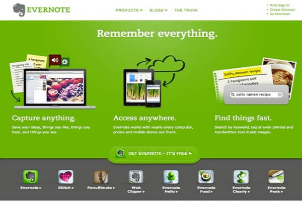
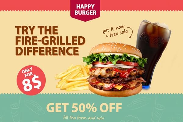
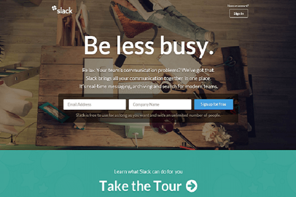
Check out how images are used by the following products for inspiration:
a. Evernote:
b. Happy Burger:
c. Slack:
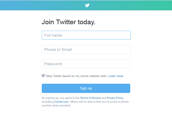
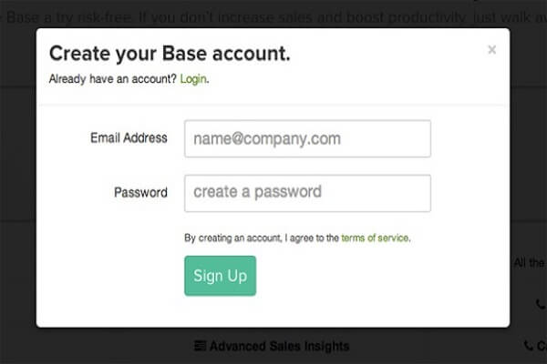
3. No-Hassle Forms
No one, absolutely no one likes to fill out forms. So do your landing page visitors a favor and include only the fields that you absolutely need. Keep your form short. That’s all, seriously.
Typically, 3-4 form fields are the ‘sweet spot’ (Name, username, email address, and password). Twitter, Firefox, etc. know this and use their minimum length forms superbly.
a. Twitter:
b. Base:
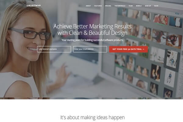
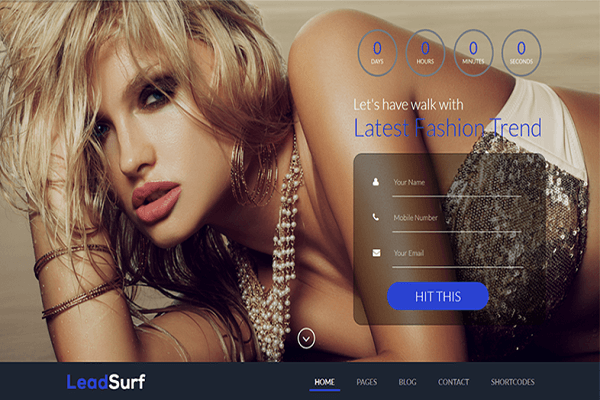
4. Call to Action Buttons
These buttons is the single element on which all your landing page efforts rest.
Make it Bold, Beautiful, and anything but generic. The color should be different (or at least contrasting) with the rest of your landing page colors.
Instead of making your CTA button say ‘Submit’ or something else just as blandly generic, go for being more specific: Say exactly what the button does (MVP), or if your product/service/branding allows it, go for something more catchy (‘Hit it’ by Lead Surf).
Look at these examples where ghost fields are combined with dramatically colored buttons:
a. SmartMVP:
b. Lead Surf
5. Uncluttered Design
An uncluttered, clean design lets the user focus on what your actual message is, instead of being distracted by obnoxious effects and loud patterns.
Whether you’re a believer of the ‘above the fold’ or not, keep your design neat and clean for minimum distraction and maximum comprehension. Also: Try to match the general design of your website/product/app to make it easier for your users to relate.
6. No Navigation
This well-known and often cited study/ split test by Hubspot on their own landing page should be enough to convince you against keeping your general website navigation on the landing page.
If you didn’t (or are unable to) read the study, it basically amounts to this: Removing unnecessary links from the landing pages increases conversion rates. It’s the same principle of least distraction and better focus at play, and it’s supported by cold hard data from landing page guru Unbounce, Hubspot, and Visual Website Optimizer.
Try to stick with the basics, and if you must, include a link to your website’s homepage (in your logo). The rest of the navigation serves little-to-no purpose on you landing page and can be safely done away with (unless you want visitors/prospects actually hopping to other pages on your site, in which case, it could be okay).
7. Trust Factor
Give your users security assurance. If you have a privacy policy, add a link to it. Add security seals (if your form requires some intrusive or sensitive information like credit card or social security number). This helps to reduce the anxiety that users may have on the idea of sharing information with a faceless website/corp.
Testimonials and case studies are always good for quality assurance, so use them.
While fake reviews/testimonials can land you in court, a small business or enterprise can’t really afford to show its real numbers. But instead of adding a lot of fake review or testimonials, go for at least a handful of trustworthy, real ones.
Your users are not as stupid as you might be inclined to think.
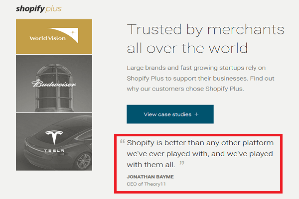
If you have real testimonials/positive reviews, add the reviewer’s name and company next to what they have said. Shopify Plus, for example, does a great job with case studies.
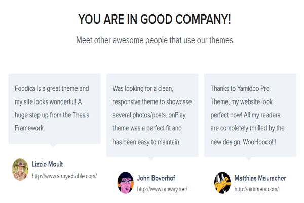
WPZoom’s testimonials include links to the client websites (and they are real too)!
Keep in mind that huge-potential prospects are less likely to be fooled by fake reviews and assorted shenanigans.
8. Bit of Social Sharing
Social liking/sharing buttons can work wonders in your favor even if you don’t convert someone. The visitor may not have clicked that CTA, but it’s likely that someone else in his/her social network might.
Again, instead of including the entire social stream (trending practice, look it up), just include some nice buttons for a select 4 (max out at 5) platforms. If you have a sizeable (or respectable) following, include the counters. The numbers are a form of social proof.
9. Creating more Targeted Landing Pages
It’s basic math, the more landing pages you have, the more your chances of conversion.
Instead of dumping all your products/services on one landing page, create separate pages to reach out and appeal to more prospects. Here’s a post by HubSpot’s Pamela Vaughan telling how a higher number of landing pages can increase your conversion rate by up to 55%.
Basically, the more landing pages you have, the more variety and opportunities you create. So why not do it?
10. Always Testing
Trial and error is the only foolproof way to become the best you can and then surpass it. The best landing pages are, more than anything, flexible and open to change.
Besides: what works for someone else (or a majority of the businesses) may not work for you. You can only create your own page, using principles and tips I have mentioned here, and improve steadily by rigorous testing.
The Upshot
Now put those ingredients together in that brilliant, intuitive way of yours and you have a lading page that actually converts.
It’s essential to keep testing, so don’t shy away from it. I have said this before, and I will say it again: even if you have a landing page whose conversion rates are satisfactory, it doesn’t mean you can’t test and land on something better.


One thought on “10 Tips for Creating the Perfect Landing Page for Better Conversion Rate”
great tips, i am going to try all