
Dear Nimble Builder users,
This new release introduces another way to insert your modules and sections. In addition to the usual drag and drop, you can now insert content by double-clicking.
Double-click insertion works in the easiest way possible. When customizing, simply click the plus icon where you want to insert content, and then double-click the module or predefined section you want to insert.
We have added new options to some modules :
- Button module : an optional text can be displayed when the mouse is held over the button
- Heading module : the heading can now be linked to a content of your site or to a custom link url. An optional text can be displayed when the mouse is held over the heading.
- Image module : an optional text can be displayed when the mouse is held over the image.
We have added support for keyboard shortcuts to undo and redo, with the usual ctrl + z and ctrl + y.
Minor bugs have also been fixed. You’ll find the full changelog at the bottom of this post.
Upcoming features
WordPress variables
The next important release will include a simple way to display WordPress contextual variables in your pages. As for example the title of the post. Variables can be included wherever you can create textual content with Nimble. The syntax will be to wrap the variable between double braces. Like this for example: {{the_title}}
This will pave the way for a simple template system for your pages. The workflow will be to create a page template, save it and reuse it another page, or for all your pages.
New pre-built sections
New pre-built sections are being designed for the next important release : for features presentation, testimonials and team.
Reusable sections
In the upcoming important release, you’ll be able to save and reuse sections anywhere, with a new save icon added to the section menu.
Reusable templates
We are working on a templating system allowing users to save entire page templates, and apply them on a by-page pasis to other pages, or to all pages.
Recently introduced features
Header and footer customization ( beta )
Menu module ( beta )
Widget area module ( beta )
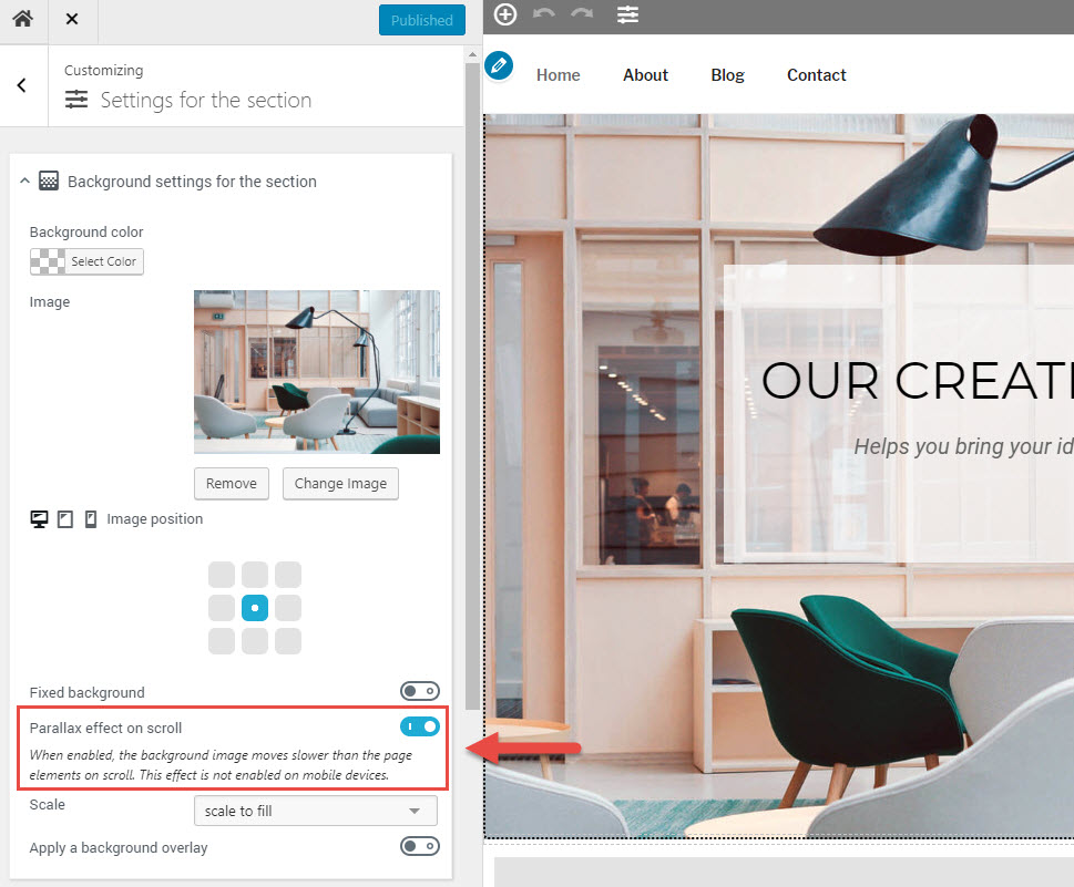
A parallax background option
The parallax effect has becomed quite famous in web design. It basically creates the visual impression that the background is moving slower than the other page elements, which is a good way to create eye catching section content.
You can see a live demo of the parallax effect on the first and last sections of this page.
To enable it in your sections built with the Nimble Builder :
- move your mouse over the desired section, open the section menu, and click on the settings icon

- Check the parallax option in the background settings of the section
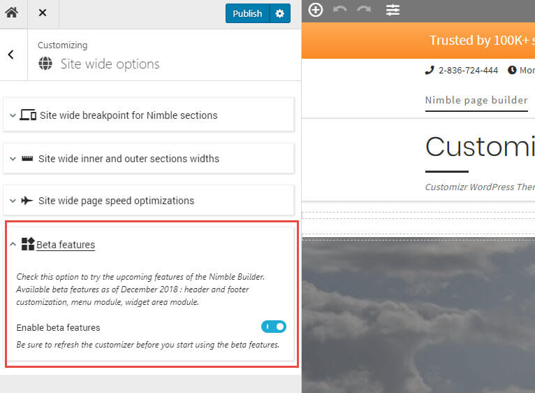
How to try the beta features ?
- Open the live customizer, and navigate to the Nimble Builder > Site Wide options
- Open the Beta features accordion, and check the box
- Publish and refresh the page
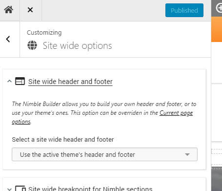
Header and footer customization
The Nimble Builder allows you to build your own header and footer, or to use the active theme’s ones. You can create a header and footer that you’ll apply site wide, and then set it on a page basis when needed.
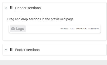
We have added 2 new simple pre-build sections, one for the header with a logo placeholder, and another for the footer, with a simple 3 columns layout.
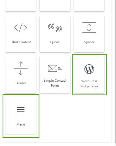
New modules : Menu and Widget Area
With the beta features enabled, you’ll see two new modules. The widget area allows you to insert a widget zone anywhere, and then use the WordPress widget in it.
The menu module let you pick one of your created menus, or the default WordPress page menu.
Changelog for v1.4.5
- fixed : Dynamic CSS : the font-size input should not have a default value
- fixed : when the value is a string of an object, no need to write an empty value
- fixed : Twenty nineteen theme heading styling, adding a border ::before Hx
- fixed : wrong selectors for the scrolling animation of the menu anchor
- fixed : [html module] removed the potentially misleading placeholder pre tag.
- improved : [button module] a title attribute can be displayed on hover
- improved : added a set of default CSS rules for headings in order to be less dependant of the theme style
- improved : reset the base font-size at location level. Ensure a consistent size in em for child nodes. Break the inheritance from the theme rules
- improved : during customization added support for undo / redo with keyboard combination ctrl + z/y
- improved : default CSS rules for links and images
- improved : allow modules and pre-built sections to be inserted by double-clicking on module / section icon
- improved : when a template is used indicate it in the customization topbar
- improved : help users created real round icon borders
- added : page building support for Internet Explorer by allowing double-click insertion
- added : [heading module] a link option
- added : a title attribute option to the heading module
- added : [image module] an option to set a title attribute
Documentation
The Nimble Builder documentation is constantly improving. Let us know if you would like us to add an article or a guide on a specific topic, we’ll be happy to include it to the knowledge base.
