Dear Hueman theme users,
This new release introduces an enhanced color picker in the live customizer. Your Hueman theme now supports rgb alpha colors.
This doesn’t modify your current customizations.
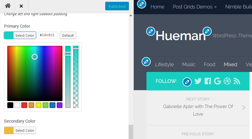
You’ll find a detailled changelog at the bottom of this post.
Recently introduced in the Hueman theme
Filtering of the blog page posts by category
You can access this new feature in the live customizer > Front page content.
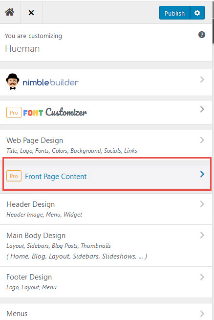
Then scroll down until you find the option named “Apply a category filter to your home / blog posts“.
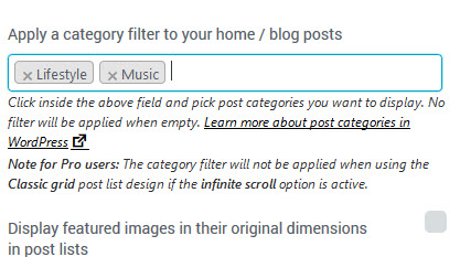
You can select one or several categories to filter your blog page posts.
Nested menus can now be expanded on mobile devices
The option is available in the live customizer > header design > header menus, at the bottom of the option panel.
You can test it in action in the live demo of Hueman.

Better integration with the Nimble section builder

We have recently released a simple yet powerful section builder named the Nimble Builder plugin.
Nimble is a free section builder intended to be the content creation companion of Hueman.
The plugin allows you to drag and drop pre-built sections, or create your own sections in live preview from the WordPress customizer. You can easily create column layouts, and add content like buttons, icons, Google maps and even contact forms in any page.
You can see a live example of Nimble sections in the Hueman theme.
You can easily install it from your WordPress admin, in Plugins > Add New.
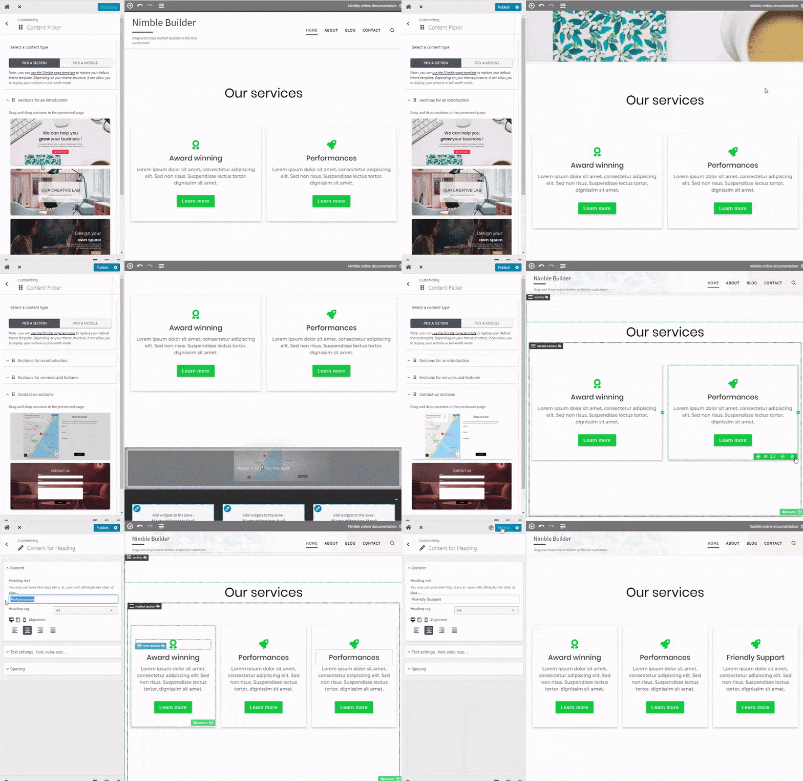
We are currently working on a knowledge base to help you getting started with the plugin, but you can take a quick tour of the Nimble Builder plugin in action, in the WordPress live customizer, on the screenshots below.
Creating a page with 3 pre-built sections


2 thoughts on “Release note for Hueman Pro v1.1.13 and Hueman free v3.4.14”
Dear Hueaman Team
First of all many thanks for the great work you’ve done.
We’ve deiced to use the free Hueman Theme for our sport’s club webpage.
While testing the Theme I figured out that the Topbar menu is behaving disadvantageous on a Tablet (Andriod) @ 1280 x 800 with Firefox , Chrome and Others when using touch input method.
When the menu is selected the list with sub-menu is disappearing in less than a second. This is preventing from selecting any sub-menu on a touch input device bigger as a smartphone. The behavior can be reproduced within Chrome developer tool on a PC when set as mobile device @ 1280 x 600. Its also there on the demo page for the “Layouts” menu.
Is there a setting I missed out that fixes this Beauvoir? If not may it be a bug?
Hi, please open a new thread about this in the Hueman forum : https://wordpress.org/support/theme/hueman
This is where our team adresses all Hueman theme’s requests and issues.
Thanks