Dear Hueman theme users,
This new release fixes minor issues and plugin compatibility problems reported in the theme’s forum and in the pro support desk.
The heading tags ( h1, h2, … ) and their font sizes have been made more consistent accross the various theme’s pages. The changes are almost invisible.
Those releases, free and pro, are safe for child theme users. The only modified template being content-featured.php, in which the thumbnail size of the featured posts is now set as a function of the layout ( = the number of sidebars ).
Note for users of cache plugin : like Total Cache or Super Cache, always purge your plugin’s cache after a theme update.
Cheers 🙂
Changelog
- ( free v3.3.14 / pro v1.0.11 ) fixed : Restrict the front ajax query when user has checked the sticky sidebars for either mobile devices or desktops, or both. Fixes #523.
- ( free v3.3.14 / pro v1.0.11 )fixed : related posts should not inherit the main post-title fittext font-size
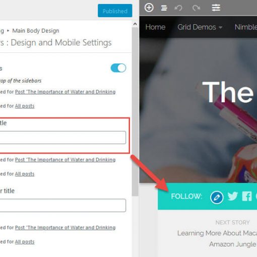
- ( free v3.3.14 / pro v1.0.11 ) added : new option in Adanced options > Mobile Devices > Make font sizes flexible , responsive font-size is unchecked by default. Fixes #522
- fixed : when doing an ajax request on front, always make sure that the response is a well formed object, and fallback on the localized param if not
- updated : flexslider.min.js. Fixes : #511
- fixed : removed check_ajax_referer( ‘hu-front-nonce’, ‘HuFrontNonce’ ); when doing a front end ajax request. Should fix #512
- fixed : boxed – avoid header elements to horizontally overflow the viewport.fixes #508 3. and 4.fixes https://github.com/presscustomizr/hueman-pro-addons/issues/48
- fixed : when the layout is boxed + sticky header on on dekstop, the width of the header should be inherited from the used width (or default one ), and not rely on %.
- fixed : comment reply font size too small when viewed in mobile. fixes #504
- fixed : wp contact form 7 style. fixes #491
- fixed : on the blog page, the ( optional ) featured posts thumbnail size was not large enough when using a 1 or 2 columns layout. ‘thumb-large’ size is now only used for 3 columns layout. Fixes #350
- fixed: fix use of the add_editor_style wp function : needs relative paths + add rtl class to the inline font style in the wp editor see presscustomizr/customizr#926
- added : a custom event “header-image-loaded” : partially fixes #508
- replaced : hu_sanitize_hex_color() by core WP maybe_hash_hex_color doing the same job since WP 3.4
- improved : change page title tag from h2 to h1 to be consistent with single posts
- improved : increased .page-title font-size from 1em to 1.3em
- improved : .single .post-title from 2.375em to 2.62em => to make them taller than h2 title inside the content. Fix #515
- improved : ‘header-mobile-sticky’ classes shall not be added to the body element when 2 menus ( ‘both_menus’) are displayed on mobiles
- added : new localized params for a fittext implementation on front
- improved : slightly increased the max font-size of comments from 0.875rem to 0.93rem
- added : the headings ( Hx ) font size is now better resized for all type of devices with a dynamic resizing. Use fittext.js => based on the heading’s parent container width, instead of relying on the css @media queries, not covering all device dimensions.
- added : include Custom Post Types in post lists ( archives and search results ). In archives, it handles the case where a CPT has been registered and associated with an existing built-in taxonomy like category or post_tag. Fixes #513
- added : new filters for hueman posts widget to alter the query args and the date format. Fixes #343
- added : ‘__before_logo_or_site_title’ and ‘__after_logo_or_site_title’ in hu_print_logo_or_title()


40 thoughts on “Release note for Hueman Pro v1.0.10+ and Hueman free v3.3.13+”
Hello there Nicolas,
I saw you changed “featured image size for featured posts” in Hueman. I don’t find it very useful because now every image shown too big in site’s homepages. I think this change is not useful as others, do not we have any oppurtunity to back to old version? What do you think about that?
Hi Kaan,
thank you for this feedback. Which default height would be acceptable for you? ( considering that we can have different number of sidebars or no sidebars )
Would it be useful to be able to set the height of this featured post’s image for you ?
Thank you 🙂
Hello there,
Before the last update, most images which I uploaded were adapted to 720 width, 340 height size. I think you changed only the height option on there. I’m using one sidebar and thumb-large image size, 720×340 was okay for me. I don’t want to make this a big problem for Hueman but Google scares me.
Whenever there is an ad with height of more then 100 pixel between logo and content in header, Google can light up an warning for move this ad or change its size. So now with your new settings content will be pushed more below the fold and we will get in trouble. Maybe you can say “then remove header ad” but this is the most profitable ad copy for AdSense publishers, we can’t afford that.
I hope you can find a good solution. Thank you for your interest.
Hi,
The Default Image Size, that was good
http://docs.presscustomizr.com/article/249-what-are-the-default-image-sizes-used-in-the-hueman-theme
Have you tested your site on https://developers.google.com/speed/pagespeed/insights/ ?
By line “Optimize images”?
On the other hand if we do not use “featured post”, not obliged to put “featured image” of 340×720 pixels, we can put a “featured image” of 245×520 pixels, right?
Thank you
Hi, yes the documentation about the default image sizes will be updated. Thanks for reporting it.
Hi,
http://www.grisayfalar.com/wp-content/themes/hueman/style.css
Bizarre that your hueman theme.css file is empty.
You do not touch the theme? Customization in the Custom CSS or Child theme ?
Sticky Sidebar is not working on free v3.3.14 🙂
Hi, can you provide the url of the site where it doesn’t work ?
Thank you 🙂
Please check this out https://www.lukmanulhakim.id/
Hmmm … I confirm that problem is on Fast Velocity Minify Plugins (FVM) 🙂
Disabled FVM, and Problem Solved 🙂
Nicolas, there was a time when I really loved your theme!
Now? Now I dread every update of the theme, and rightly so!
The latest changes to the H-headers creates problems again!
Recently I gave all headers my own definitions in my child-css. Your latest changes overwrite my sizing, they seem to be hard-coded instead done in the theme’s css file!
Result: this now leaves every one of my post headlines with a ‘widow’ on 1920 screen resolution – the standard for most modern laptops. My headlines are (Google-permitted) length of 55 characters.
In case you don’t understand: a widow is SINGLE
WORD
left standing alone in a line.
Have you lost all sense of design and website programming? Sorry, but this is the third such change in styling in 4 updates, which you seem to have applied outside the theme’s css file – no easy way to overwrite this!
Sorry, your word limit of only 150 forced me to cut most other nice words from the comment above…
Too lazy to read anything long?
I understand your frustration and I’m really sorry that the updates are generating problems for you.
But please forgive us.
We try to satisfy our users the best we can with the features that they need. As you can see on github, we have a lot of issues / enhancements to handle.
But at least 50% of our work is done to make sure that the theme stays 100% up to date and compatible with :
Add to this that the theme is used by more than 80 000 users, who are potentially adding their custom code with child theme or custom css.
As you can imagine, maintaining a 100% safe and bug free theme in those conditions is an almost impossible task.
But we try to do it, and for the moment I consider that my (small) team and I succeed. Hueman is more and more used and still gets awesome reviews, which makes me very happy, despite all the troubles.
Thank you very much for your understanding and patience 🙂
Cheers
Hi Juergen,
I’m sorry that this last update is in conflict with your custom css.
Have you tried to set a higher specifity to your custom css rules with the !important flag ? This way, your own headings css rules will always “win”.
Example :
.entry h2 {

    font-size:1.2em;

}
becomes
.entry h2 {

    font-size: 1.2em!important;

}
I hope this will help.
bonjour
avec la nouvelle version, impossible de modifier la taille des polices H1, H2, H3… je me retrouve avec des sous-titres énormes. Y a t-il possibilité d’avoir la main sur ces paramètres ?
merci d’avance
Benoit
Bonjour,
Vous pouvez ajouter !important à vos règles css, elles seront ainsi appliquées en priorité, avec la plus haute spécificité.
Exemple :
.entry h2 {

    font-size:1.2em;

}
devient
.entry h2 {

    font-size: 1.2em!important;

}
/?huajax=1 still killing me.
https://gtmetrix.com/reports/investmentwatchblog.com/S6Wqb8RQ
Please email for the solution. Its urgent.
Hi,
A fix is on its way for v3.3.14
Cheers
This update caused an issue for me too. I’ve customized the font size of H1 and H2 and after the update H1 and H2 size changed and got too big. Is there an easy way to fix it?
Hi, I have an issue with this update. It’s caused the fonts in the main bodies of my posts to enlarge by a couple of sizes, and no matter what I do I can’t get it to change uniformly across the site (including edits in the customizer and even CSS changes). It now looks uneven and clumsy. Please advise?
hi, I think the author changed the size of the writing font of the HN, it’s way too big, it was better before.
I too would like to rectify all this, it “breaks” the layout of my posts.
Yeah, the font for the related articles below posts is also way too large.
Hi,
Everything is too wide, the size of the titles in H1, the subtitles in H2, the H3,
Everything has been put in a size too large, I would like to fill the sizes that please me.
For once, very disappointed with the update.
Look how ugly it is on my site since
https://foxdao.net/transformers-last-knight-mark-wahlberg/
Hi Petr, thank you very much for reporting this issue, we are working on a fix.
Hi, we are working on a fix. Thank you for reporting the problem 🙂
Update caused an issue within free theme, no post-images are visible when I directly access to website. When I edit a post and click “preview” no problem remains. But when I save it and close and load site or post (firefox – chrome – ie) site shows no post-thumb or any other inline post image in site.
I just want to assure you that this problem is update related issue since when I rolled back with WP-Rollback plugin to 3.3.12 version, problem gone like magic. Done redo – undo couple of times, images disappeared in everytry, but couldn’t found the problem. FYI.
Hi,
If you are using a cache plugin like Total Cache, Super Cache, WP Rocket, … can you make sure that you purge/refresh the cache of this plugin ?
Let me know if it helped.
Cheers 🙂
I have the same issue and I’m currently looking for a hotfix. Anyone knows?
Hi Carol,
Are you using a cache plugin to improve the performance of your website ? ( like Total Cache, Super Cache, WP Rocket, … )
If yes, can you make sure that you purge/refresh the cache of this plugin ?
Let me know if it helped.
Cheers 🙂
Hey,
I have purged the entire cache of my website but the issue is still present.
Where should I dig to find out the issue?
The problem usually disappear when you uncheck the option “load images on scrol” in the live customizer > advanced panel > performances.
You can also check if there’s a conflict with one of your plugin, by deactivating all your plugins and re-activate them one by one.
Let me know if it helped.
I have disabled the “Load images on scroll” option and it fixed the issue. It’s a pity that this setting is causing problems, I really liked and and I found it very useful.
I disabled all of my plugins to see if there is some kind of conflict but I couldn’t find any, so I guess it’s a bug related to “Load images on scroll” option somewhere.
Looking forward to a fix for this issue!
All the best!
Hi Carol, thank you for this feedback.
I can’t replicate the problem on my hand, this setting is working fine.
Can you confirm that the “load image on scroll” option is not working, even whne all your plugins are disabled ?
Thanks !
This update caused an issue for me. I have a simple table in the header widget and it used to display fine on mobile but after this update the content of the widget overflows into the page title below. The header area used to resize dynamically based on the header widget but now seems fixed. Is that an intentional change or just an unforeseen consequence of some other fix? See my website ElonX on mobile to see what I mean. Or maybe I can accomplish what I’m trying to do differently? Using an HTML table seemed the easiest but I only know basic HTML/CSS so maybe there is a more clever and appropriate way?
Thank you very very very much for the big work ! 😉
You are welcome 🙂
Bonjour,
J’avais trouvé Default style sheet for HTML 4, qui indique la taille en em pour Hn (il manque H4) et autres codes, je ne sais pas si vous connaissez et si cela peut vous être utile ou pas ?
https://www.w3.org/TR/CSS22/sample.html
h1 { font-size: 2em; margin: .67em 0 }h2 { font-size: 1.5em; margin: .75em 0 }
h3 { font-size: 1.17em; margin: .83em 0 }
h5 { font-size: .83em; margin: 1.5em 0 }
h6 { font-size: .75em; margin: 1.67em 0 }
Bien à vous
Thank you very much for sharing this table. Very interesting to keep as a reference.
Bonjour,
Je trouve que l’écriture des Hn est trop grosses maintenant, 31.5px pour H3, c’est trop grand, H2 38.25px, h1 41.92px
c’est quoi ces codes fittexted_for_content_h2 ?
tiens je vois finir l’url de mon site par /?huajax=1, c’est quoi ce truc ?