Dear Customizr theme users,
The dev team at Press Customizr is happy to share a few words with you about the latest version of your theme.
What’s new / improved in the new release ?
In the last release we have added support for the full width cover images of the upcoming new WordPress editor ( currently named Gutenberg ), available in WordPress 5.0 in a few weeks.
This new release keeps improving support for the new editor by fixing problems with the video embed, reported by our users. Thanks a lot for all your bug report and contributions :). The blockquote block of the new editor has now been made fully compatible with the Customizr theme.
We have also improved the compatibility with the Nimble Builder plugin.
Three new social icons have been added : Line, Map and Discord.
We have also deeply tested the Customizr theme with the upcoming 5.0 version of WordPress, scheduled for November. Some minor problems have been discovered and fixed. You’ll be able to safely update your site to WordPress 5.0 when you’ll see the notification in your WordPress admin.
Detailled changelog at the bottom of this post.
Recently introduced in the Customizr theme
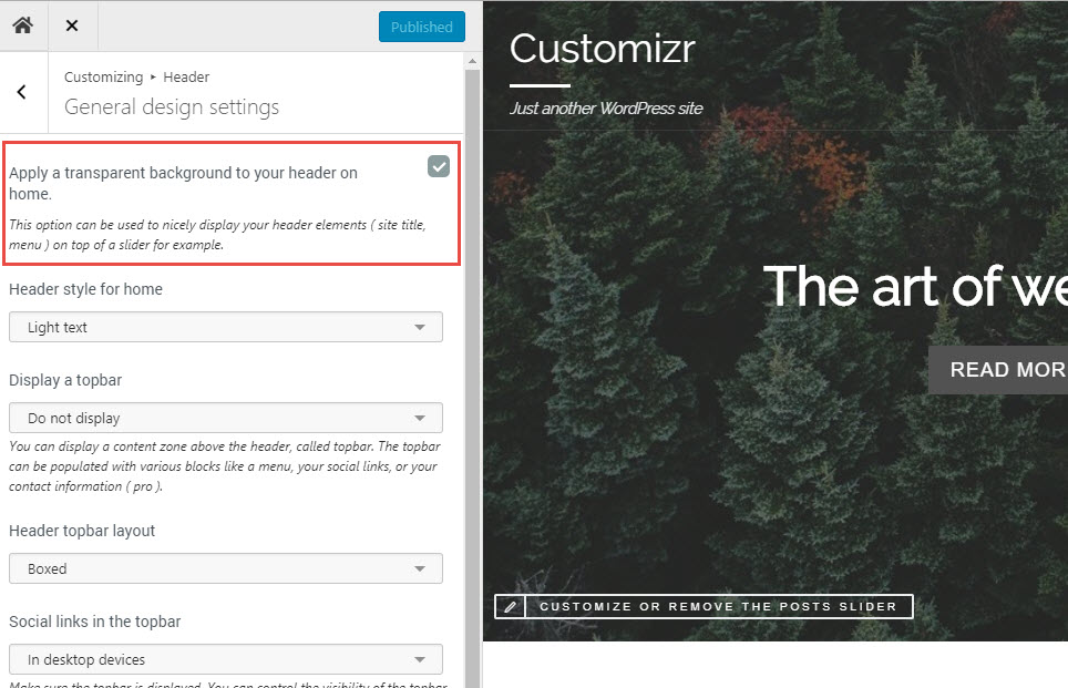
New option for a header on top of your content
This new release introduces a new checkbox option for your header, allowing you to make it transparent and positionned on top of your content.
The option is only available for your home page.

The example below shows how it looks when displayed on top of a home page slider.

Better integration with the Nimble drag-and-drop builder
We have also been working on a section builder named the Nimble Builder. Nimble is a free section builder intended to be the content creation companion of Hueman.
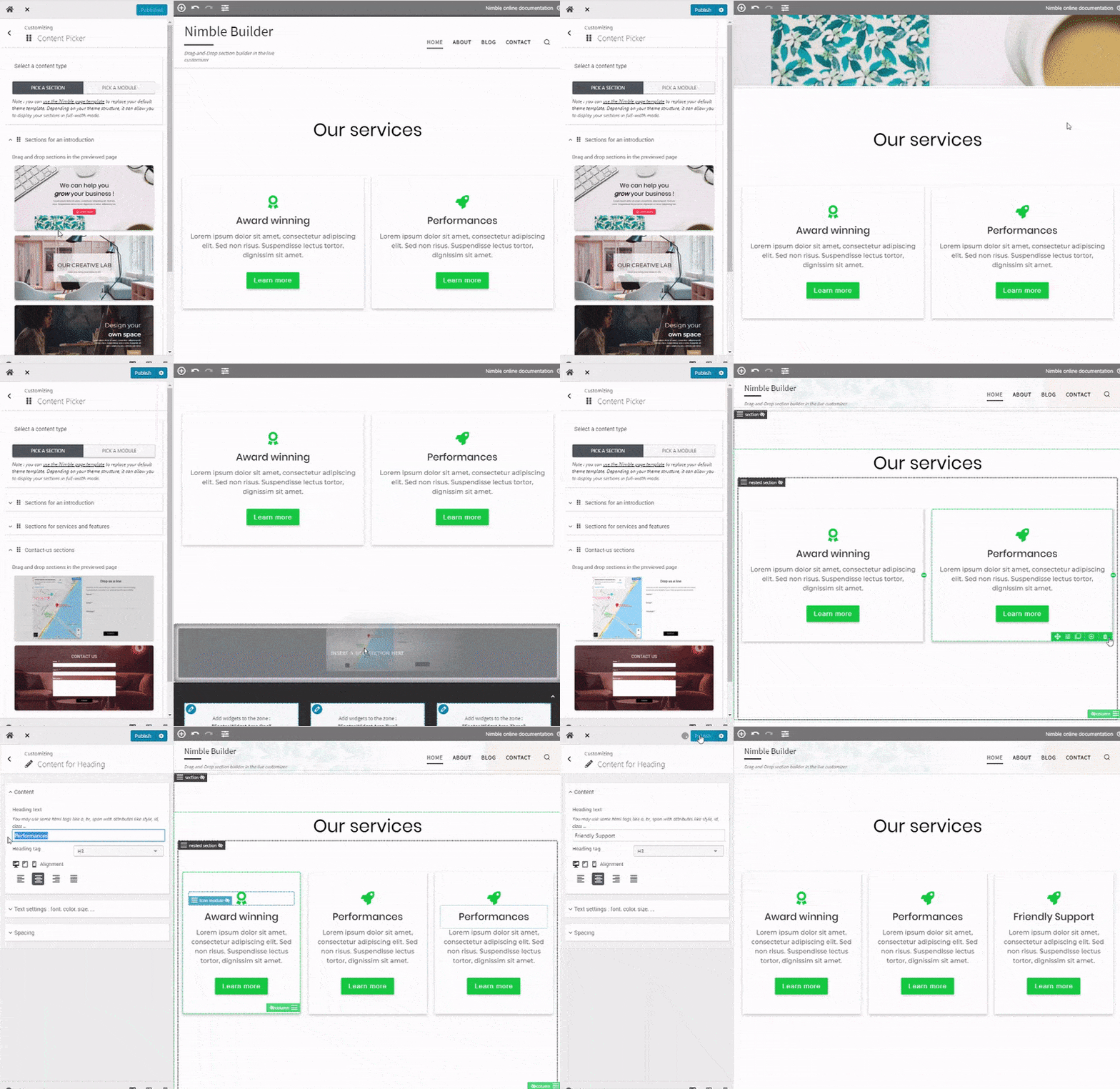
The Nimble Builder allows you to drag and drop pre-built sections, or create your own sections in live preview from the WordPress customizer. You can easily create column layouts, and add content like buttons, icons, Google maps and even contact forms in any page.
You can see a live example of Nimble sections in the Hueman theme.
You can easily install it from your WordPress admin, in Plugins > Add New.
We are currently working on a knowledge base to help you getting started with the plugin, but you can take a quick tour of the Nimble Builder plugin in action, in the WordPress live customizer, on the screenshots below.
Creating a page with 3 pre-built sections

Changelog
- fixed : updated url to https://gmpg.org/xfn/11 see presscustomizr/hueman#714
- fixed : potential compatibility issue with WordPress 5.0. for #1623
- fixed : element id duplication when using horizontal primary menu
- fixed : html validation for meta with http-equiv attribute with value X-UA-Compatible: must have the value IE=EDGE fixes #1583
- improved: added new WP editor responsive embeds support
- improved: new WP editor blockquote style. Part of #1601
- added : 3 social icons to the social links module : Line, Map, Discord


18 thoughts on “Release note for Customizr Pro v2.1.10 and Customizr free v4.1.21”
Hello again,
i have seen, that i wrote my comment in german. Now again in english 🙂
I am very happy with the topic and use the Pro version. Since one of the last updates, the mobile menu on mobile and tablet is not working that way anymore. The submenus appear to be a completely transparent area so that the menu in the upper area is no longer readable. Have already checked all possible settings, but find nothing where I could adjust something else.
I have photographed the phenomenon, but do not know how I could show it here.
I would be very grateful if you could help me, so that the menu in the mobile version works well again.
Thank you in advance.
many Greetings
Birgit
if you go to – header>Design settings for smartphones and tablets in portrait orientation>(I used google translate here: ) Expand submenus when clicking – and uncheck it
Now all menus on the phone will expanded ( making 1 very long vertical menu ) but at least the customers can see the menu again and work with it (my solution for the moment).
FOR THE DEVELOPERS: please solve this problem.
With “expanded submenus when clicking” checked the menu background on the phone will become transparant when you tap on one of the items.
And the customer can no longer read the menu.
BTW if you use the arrows on the right it sometimes will work again, but tapping on menu items makes it fail.
OK thank you for providing those details about the bug.
We’re working on a fix!
Same for me, on mobile when you open a submenu the background area of the entire menu becomes transparent and the customer can no longer read the menu.
-How to to copy this behavoir:
On mobile phone (not on pc! here it works ok)
1 click on hamburger
2 menu opens ok
3 click on a submenu
4 sub menu opens ok
5 directly after that the background becomes transparant
BTW when the menu background is transparant and I try using the expand icons on the right in the menu, everything will start working correctly again.
– Temporary Solution:
For now as a temporary solution I unchecked – header> Design settings for smartphones and tablets in portrait orientation> Expand submenus when clicking.
This will expand all submenus and leave me with one big menu, but at least it is readable again.
OK thank you for providing those details about the bug.
We’re working on a fix!
OK Thanks for reporting this issue.
We’re working on it. You can share your screenshot with the contact form on this page : https://presscustomizr.com/contact/
Hello,
We’ve investigated the problem. For now we’ve been able to reproduce the problem with Chrome on Android mobile devices.
We suspect a bug introduced in a recent version of Chrome.
We can fix the issue with a simple line of CSS code :
.mobile-nav__nav { backface-visibility: hidden }Would you mind copying and pasting this line of CSS code in the custom css option of the live customizer, and let me know if it fixes the problem for you as well ?
When testing code, make sure you disable any active cache plugin, and clear your browser cache.
Thanks
Hello,
Works fine here, thank you very much!
Android and chrome here.
OK thanks for the feedback.
Hello Nicolas,
thank you very much for your help. I have added this “.mobile-nav__nav { backface-visibility: hidden }” in the style.css of my customizr child theme and now everything is working again very fine 🙂
Thanks and greetings
Birgit
OK great.
Thanks for the feedback.
Ich bin sehr zufrieden mit dem Thema und verwende die Pro Version. Seit einem der letzten Updates funktioniert das mobile Menü auf Handy und Tablet nicht mehr so ganz. Es erscheint bei den Untermenüs ein vollkommen transparenter Bereich, so dass das Menü im oberen Bereich nicht mehr zu lesen ist. Habe schon alle möglichen Einstellungen kontrolliert, finde aber nichts, wo ich was anderes einstellen könnte.
Ich habe das Phänomen abfotografiert, weiss aber nicht, wie ich es hier zeigen könnte.
Ich wäre sehr dankbar, wenn man mir helfen könnte, damit das Menü in der mobilen Version auch wieder einwandfrei funktioniert.
Vielen Dank schon mal im Voraus.
Viele Grüße
Birgit
Very very satisfied of this wordpress theme, since i’m using it. Thank you for the good job ! I
thanks 🙂
Hey guys,
using your theme for over half a year now and everything works fine on my site. Thanks for the continuous updates!
Michel
thanks 🙂
Mettete la possibilità come nel tema #Human di inserire il proprio logo nel footer tema.