Dear Customizr theme users,
The latest version of Customizr Pro and free themes ( Customizr Pro v2.1.43 and Customizr free v4.1.53 ) are fully compatible with the latest WordPress release ( v5.3.2 ).
Changelog
- fixed : [Search form] Implements a better search form, more suited to web standards => added a search button next to the search input field

- added : “flipboard” social network to the list of icons

- fixed : text on search button might not be visible on a dark background
improved : added support for HTML 5 “async”=> removed in v2.1.43
- improved : Post default layout should be full width for new users
- Customizr free and pro are 100% compatible with the new video background included in Nimble Builder. See Nimble Builder now supports video 📽️▶️ background for sections : self-hosted, Youtube or Vimeo.
Developers : the search form template has been modified. See the diff report here.
Recently introduced in the Customizr theme
Better integration with Nimble Page Builder
We have recently released a simple yet powerful section builder named the Nimble Builder.
Nimble Builder allows you to drag and drop pre-built sections, or create your own sections in real-time from the WordPress customizer. You can easily create column layouts, and add content like buttons, icons, Google maps and even contact forms in any page.
Check out a live example of Nimble sections in the Customizr theme.
You can install it from your WordPress admin, in Plugins > Add New, search for Nimble Builder.
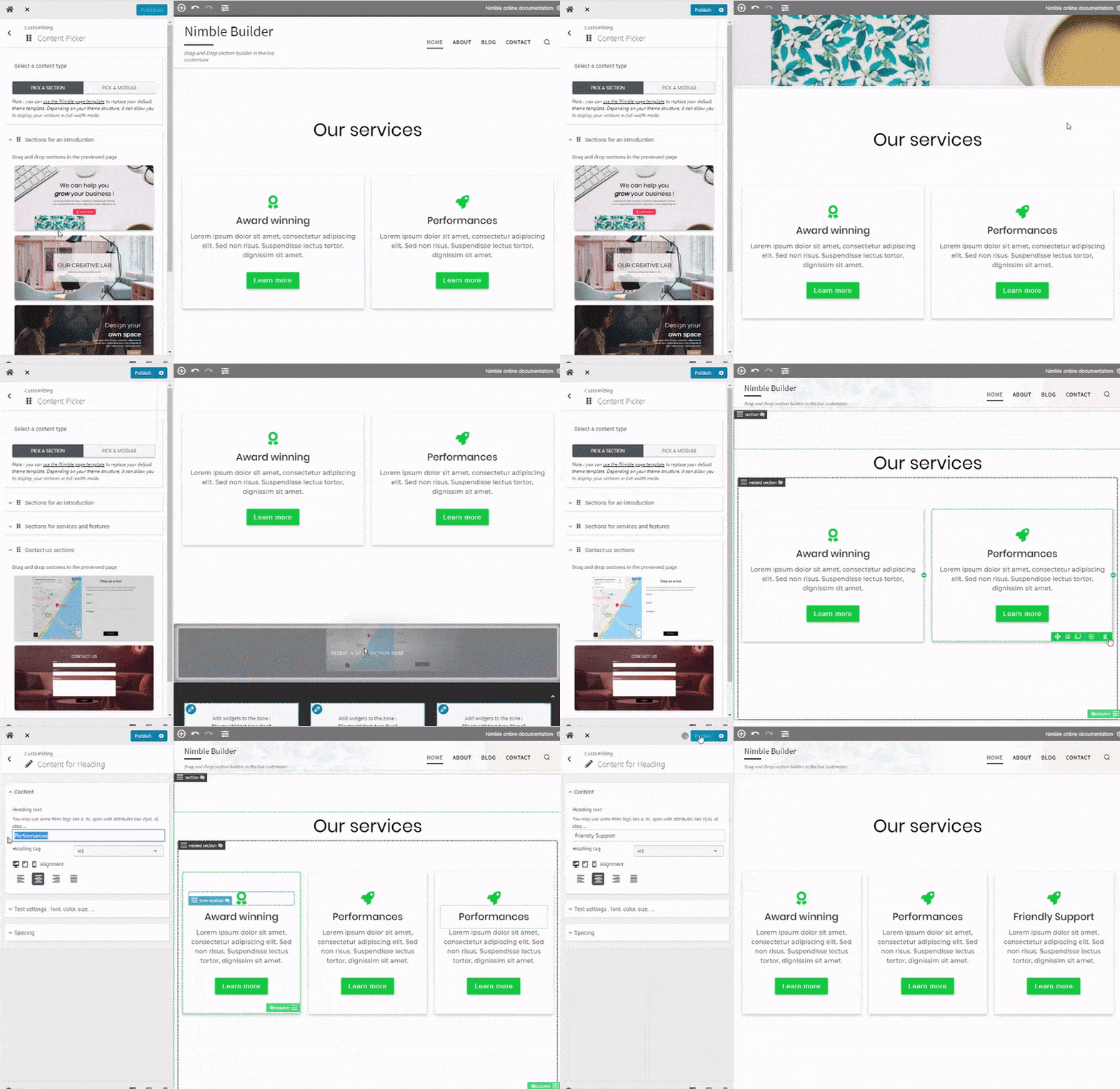
We are currently working on a knowledge base to help you getting started with the plugin, but you can take a quick tour of the Nimble Builder plugin in action, in the WordPress live customizer, on the screenshots below.
Creating a page with 3 pre-built sections
New option for a header on top of your content
We have recently introduced a new checkbox option for your header, allowing you to make it transparent and positionned on top of your content.
The option is available for your home page when using the modern style of the theme.
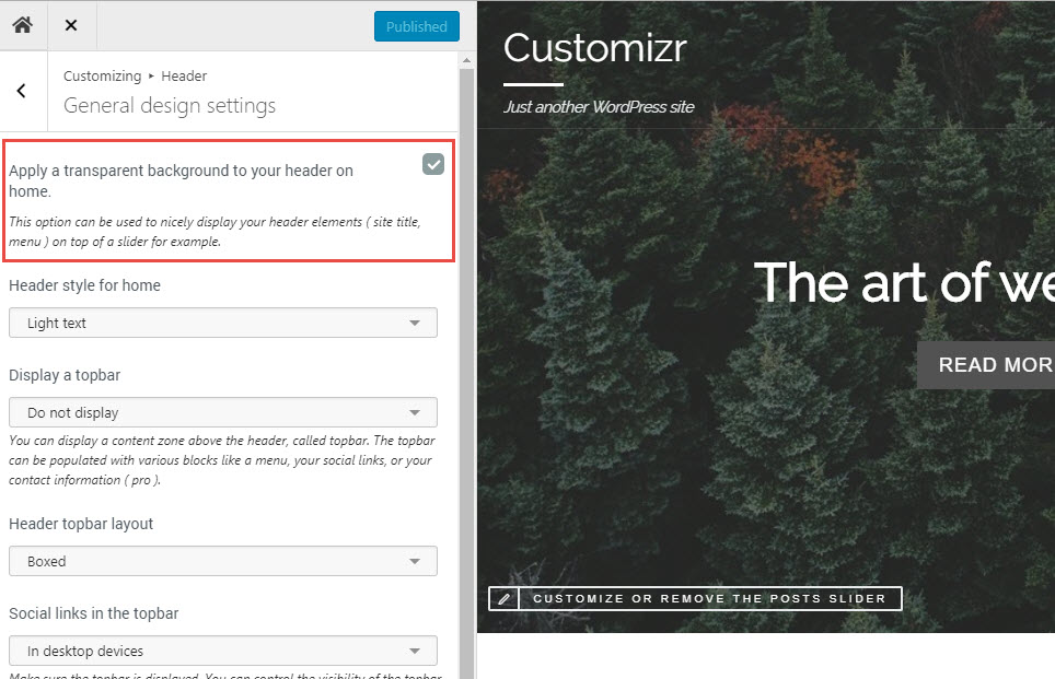
The example below shows how it looks when displayed on top of a home page slider.

Credit photo : http://www.documentsdartistes.org/artistes/ganne/repro32.html
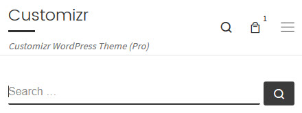

6 thoughts on “🔎 A new search form for Customizr free (v4.1.53) and pro (v2.1.43)”
love the updated search look
Is there a way to suppress the “Search” button that now appears in the Search form, or to put it on a separate line?
I have a search field in a sidebar and the button overflows the space available.
Thanks for reporting the bug. Is it the same problem that can be seen with the search button located in the left sidebar on this page ?
We’re working on a quick fix for the next release.
Thanks – the latest update seems to have fixed the problem.
Another comment: I like the way that the search icon on the menubar works on smartphones by clicking on the hamburger icon.
On a desktop device, clicking the menubar search icon throws you into a full-screen popup, which I find disconcerting.
Could you make the desktop search icon show a small drop-down search form, as it does on smartphones?
I like the way that the search icon on the menubar works on smartphones by clicking on the hamburger icon.
On a desktop device, clicking the menubar search icon throws you into a full-screen popup, which I find disconcerting.
Could you make the desktop search icon show a small drop-down search form, as it does on smartphones?
Hello,
Yes we have had this request several times to propose a simpler default search field instead of the full screen one.
This is on top of the priority improvements for the next release.
Thanks for reporting