
Dear Customizr theme users,
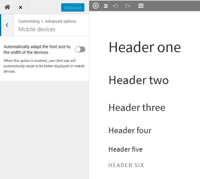
This new release deactivates the adaptative font size for headings. Users reported that it could shrink too much the font size. It can be activated from the live customizer.
Note for child theme developers : no template or core function has been modified.
Recently introduced in the Customizr theme
Better integration with the Nimble drag-and-drop builder
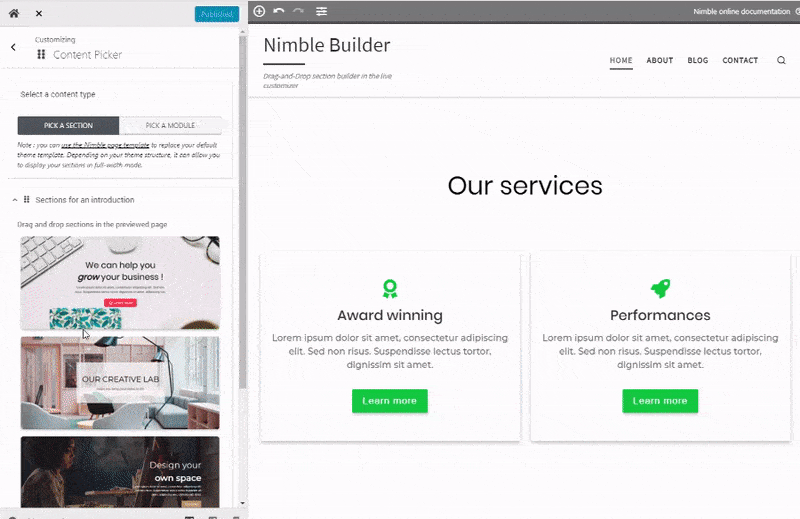
We have recently released a simple yet powerful section builder named the Nimble Builder.
Nimble Builder allows you to drag and drop pre-built sections, or create your own sections in real-time from the WordPress customizer. You can easily create column layouts, and add content like buttons, icons, Google maps and even contact forms in any page.
Check out a live example of Nimble sections in the Customizr theme.
You can install it from your WordPress admin, in Plugins > Add New, search for Nimble Builder.
We are currently working on a knowledge base to help you getting started with the plugin, but you can take a quick tour of the Nimble Builder plugin in action, in the WordPress live customizer, on the screenshots below.
Creating a page with 3 pre-built sections
New option for a header on top of your content
We have recently introduced a new checkbox option for your header, allowing you to make it transparent and positionned on top of your content.
The option is available for your home page when using the modern style of the theme.
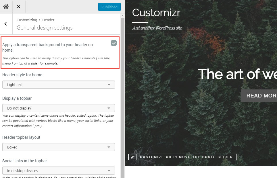
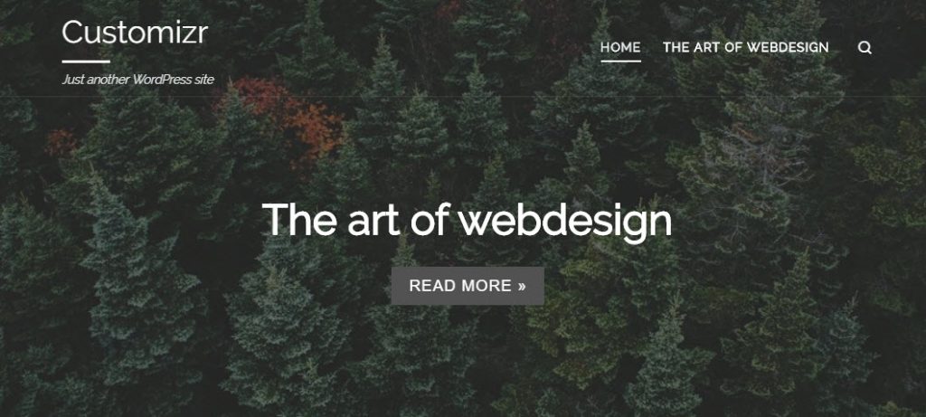
The example below shows how it looks when displayed on top of a home page slider.


2 thoughts on “Adaptative font size on mobile devices is now an opt-in option. Customizr Pro v2.1.30 and Customizr free v4.1.40”
Hi there, I have been using your Customizr free for quite some time and I definitely love it! However, after updating the theme to the latest version, the Blog page (which automatically shows all blog post) will always show ERROR 404. I tried to replace the Blog page with another newly created page but it still shows the error.
Hope you can help me with this. My website is http://www.spmsoalan.com Thank you!
James
OK thanks for reporting your issue. Please open a new thread in this forum : https://wordpress.org/support/theme/customizr
This is where our team takes care of request and debugging.
Thanks